The Villain Outshines the Princess

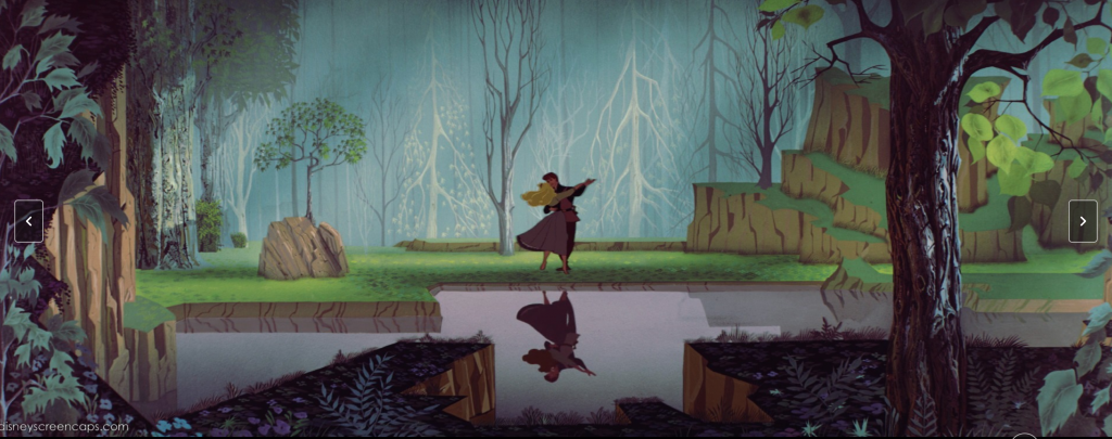
I love the original Disney version of Sleeping Beauty, but my reasons have nothing to do with the tale surrounding the sleeping princess. The artwork is what draws me to this film, as I am a fan of the old art style of Disney animated films. Specifically, in this movie, the background scenery is pleasing to me.

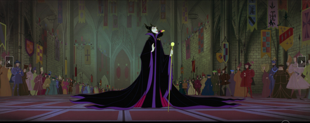
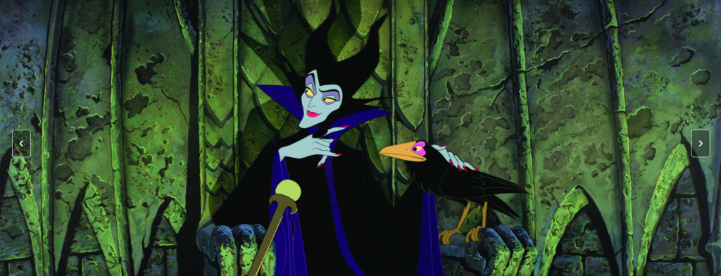
The other reason I love this film is for the infamous villain Maleficent. From the moment she is introduced into the film, she commands your attention, and has such a presence in every scene she appears.

I thought it was interesting that Disney developed such a different villain from the original story. Maleficent has power and agency throughout the story, which contrasts significantly with Aurora’s character, who has no control over what happens to her.

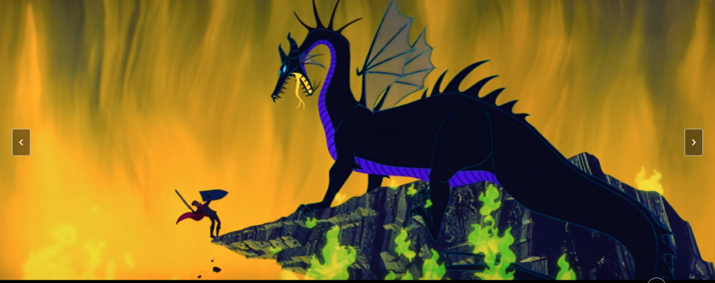
Another thing I’d like to note is Maleficent’s character design. When she is in human form she has this long billowing cloak. She takes up space. She gets even larger later in the film when she transforms into a dragon. In contrast, Aurora’s design is a small, petite woman. These character designs remind me of our discussion about Ariel and Ursula’s designs in the Disney film as well.

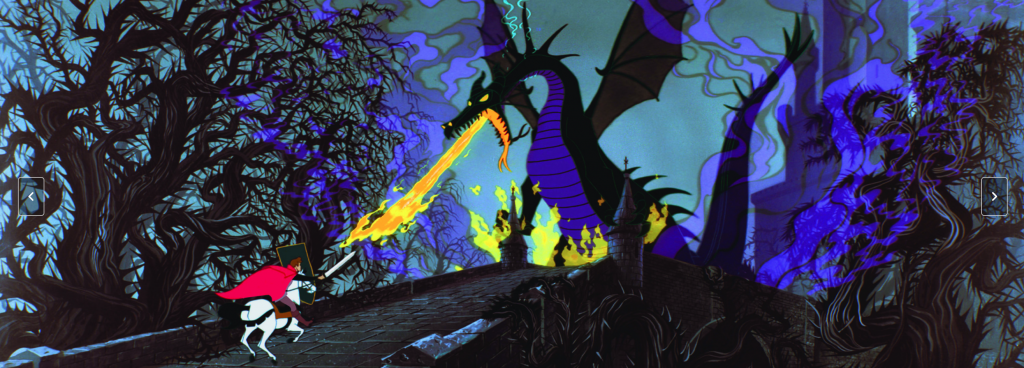
In the end, however, Maleficent is defeated, which definitely sends a message about what kind of women is “right” within the story: the quiet, pretty, passive one. Maleficent has accrued a significant fan base throughout the years, and Disney even chose to develop her in their re-make. This move was smart on their part, as I don’t know many who care much for the original tale of the sleeping beauty and the messages within it. The villain definitely outshines the princess in this version.

All images source: Animation Directors for these scenes: Marc Davis and Eric Larson (1959) https://m.imdb.com/title/tt0053285/mediaindex/?ref_=tt_mv_sm

Human vs. Nature

In my opinion, this poster does a better job than any other art I have seen depicting the story of Little Red Riding Hood. It puts into perspective how vast the gap in agency is between the Wolf and Red, depicting the Wolf as a sort of unstoppable force of nature. Red however sticks out like a sore thumb over the grey background, showing how terribly out of place she is in this setting. There is a certain carefree attitude she is portrayed as having here, as if this is soon to be nightmare is just another walk to grandmas house. I also love how the wolf looks totally unnatural, like an unfathomable eldritch horror waiting for weaker beings like Red to stumble under its terrible umbra.

Halle Bailey as Ariel

One thing I was really interested in looking for when searching for art was images that portrayed the Little Mermaid. I wanted to see different interpretations on how she looks to artists based on the Disney version and other adaptations as well.

I came across this image and it immediately brought a smile to my face.

Artist and medium is unknown, year 2020 found on Pinterest.

We only briefly talked about this in class, but I do have so many thoughts on the new live action Disney version of The Little Mermaid. In this version, Halle Bailey is casted as Ariel and has gotten a lot of criticism thrown at her. There have been many blatantly racist comments made towards her being Ariel and quite frankly I think it’s outrageous.

In this image, I think the artist did a fantastic job at portraying who Ariel really is. In the Disney movie, Ariel loves her sidekick Flounder and she’s known for her beauty. This image does Ariel justice. It has her long red hair, her green tail, her sidekicks, and other sea creatures as well. The colors are bright and the contrast between the darker blues and her red hair and darker skin tone just pop. People are criticizing Halle Bailey, but it’s just an excuse to be racist. She has everything she needs to be the perfect Ariel. She has the red hair; the beautiful singing voice and I’m looking forward to seeing the movie no matter what the critics say.