Get the Power – Blog Post 5

Gender studies: an examination into the ways in which literature reproduces and subverts cultural norms surrounding gender roles. 

Since we discussed Sleeping Beauty and the Airplane in class, alongside our discussion of gender and queer studies, I couldn’t stop thinking about what a strange story it was. It both objectified a woman and gave her agency that was nonexistent in the original fairy tale. In that vein, I became interested in media that both subvert and reassert gender norms. 

In my search for a reflection of this phenomenon in contemporary media, I came across this 1940s advertisement. 

Pfeiffer, Lisa. “Clorox Get the Power Advertisement.” Critical Commons, 22 February 2017, https://criticalcommons.org/Members/Lizcav/clips/clorox-get-the-power-advertisement-1. Advertisement originally published in the 1940s.

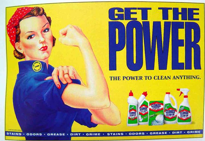
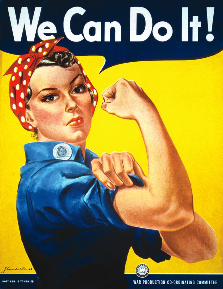
The iconic image of Rosie the Riveter is the first thing you see. If you look closer, you may notice that she’s not the same Rosie shown below.

Pfeiffer, Lisa. “We Can Do It!” Critical Commons, 22 February 2017, https://criticalcommons.org/Members/Lizcav/clips/clorox-get-the-power-advertisement-1. Advertisement originally published in the 1940s.

First, you might see her makeup looks a little more prominent than usual. Then, you’ll likely notice her wedding ring, or her painted fingernails. She’s a feminized Rosie. 

Of course, you’ll notice the big blue letters: “Get the POWER.” Rise up, take charge, assume the place in the world you deserve that you’ve always been denied… as a cleaner. “The power to clean anything.” 

This advertisement uses an iconic subversion of traditional gender roles to argue that women should be content in those traditional gender roles. The most prominent features of the ad are the instantly recognizable Rosie the Riveter figure and the statement “Get the POWER.” We associate these features on sight with the subversion of traditional gender roles for women as docile, domestic caretakers. It’s only once we have made this mental association that we notice the traditional expectations seeping through in the details. This display of unconventional and conventional side by side is an attempt to encourage women viewers to associate traditional feminine gender roles with empowerment and agency.  

Examining this advertisement through a gender studies lens shows us that the “breaking” of traditional gender norms can ultimately serve as a tool to reinforce those same norms.

Blog prompt 5 (surnames P-Z, due Monday, Oct. 3 by 5 pm; comments due Wednesday by 5 p.m.

This week, your post will serve as prewriting for Essay 2, asking you to practice argumentation by applying a critical perspective to a new text.  Here’s the prompt:

Do the critical approaches we’ve studied so far provide insight into contemporary culture as well as literary texts?

And here are the specifics:
1) In your post, share a very brief, contemporary text:  an image, short film clip, newspaper headline, notice of an event, etcetera. Be sure to choose a text that can be analyzed from one or more of the critical approaches we’ve discussed so far.

2) Add a concise (200 word max) analysis of the text.  Your analysis must use close reading skills (e.g. focus very specifically on your text); it must also draw explicitly on the insights of one of the critical perspectives we’ve studied so far this semester. At the end of your analysis, comment on what this perspective allowed you to see–or, conversely, what it prevented you from discussing.

3) Take the prompt seriously (e.g. don’t choose an advertisement that does not include images of gender, apply a feminist film studies perspective, and then conclude that “the gaze” is a useless critical concept). But also feel free to analyze the weaknesses of the critical method you chose.
Possible perspectives:
Humanist
Formalist (close reading of text only)
Structuralist  (e.g. apply Propp to identify the plot moves that underly anime, etc.)
Feminist, gender, and queer studies
Psychoanalysis

The Villain Outshines the Princess

I love the original Disney version of Sleeping Beauty, but my reasons have nothing to do with the tale surrounding the sleeping princess. The artwork is what draws me to this film, as I am a fan of the old art style of Disney animated films. Specifically, in this movie, the background scenery is pleasing to me.

The other reason I love this film is for the infamous villain Maleficent. From the moment she is introduced into the film, she commands your attention, and has such a presence in every scene she appears.

I thought it was interesting that Disney developed such a different villain from the original story. Maleficent has power and agency throughout the story, which contrasts significantly with Aurora’s character, who has no control over what happens to her.

Another thing I’d like to note is Maleficent’s character design. When she is in human form she has this long billowing cloak. She takes up space. She gets even larger later in the film when she transforms into a dragon. In contrast, Aurora’s design is a small, petite woman. These character designs remind me of our discussion about Ariel and Ursula’s designs in the Disney film as well.

In the end, however, Maleficent is defeated, which definitely sends a message about what kind of women is “right” within the story: the quiet, pretty, passive one. Maleficent has accrued a significant fan base throughout the years, and Disney even chose to develop her in their re-make. This move was smart on their part, as I don’t know many who care much for the original tale of the sleeping beauty and the messages within it. The villain definitely outshines the princess in this version.

All images source: Animation Directors for these scenes: Marc Davis and Eric Larson (1959) https://m.imdb.com/title/tt0053285/mediaindex/?ref_=tt_mv_sm