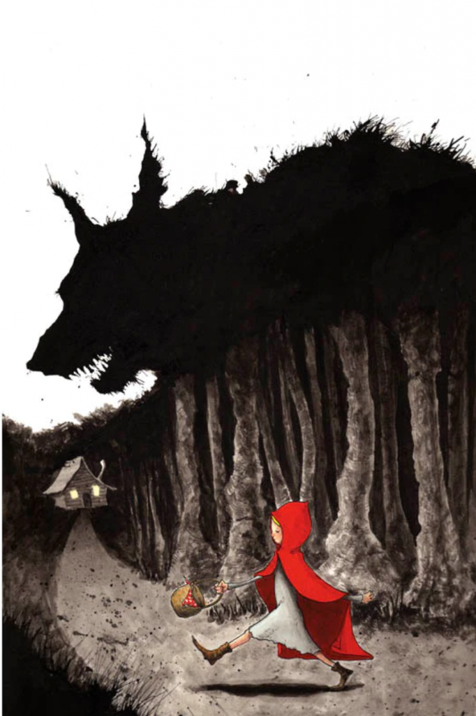
In my opinion, this poster does a better job than any other art I have seen depicting the story of Little Red Riding Hood. It puts into perspective how vast the gap in agency is between the Wolf and Red, depicting the Wolf as a sort of unstoppable force of nature. Red however sticks out like a sore thumb over the grey background, showing how terribly out of place she is in this setting. There is a certain carefree attitude she is portrayed as having here, as if this is soon to be nightmare is just another walk to grandmas house. I also love how the wolf looks totally unnatural, like an unfathomable eldritch horror waiting for weaker beings like Red to stumble under its terrible umbra.

I enjoyed the way this image portrays the naivety of Little Red Riding Hood, as blindly walking down this path is completely oblivious to what awaits her. I am curious why the artist made everything have the sinister feel you describe, with even the woods having eerie feelings, which makes me question why the child is so eager to roam there. I would have liked to read which Little Red Riding Hood version is most translated by this piece and if you have any commentary regarding the contrasting art styles of the wolf and Little Red Riding hood.
This image caught my attention when I was looking through the posts this week. I think you did a nice job highlighting the different aspects of the photo and what they represent. I specifically liked how you pointed to the depiction of the gap in agency, showcased by the large looming wolf who melts into the trees and the small girl sticking out in a corner of the photo. Like Liz pointed out, I think it would have added your post if you, perhaps, related this image to a version you thought it fit best. Overall, I liked your analysis of the components of the image.
I really love the piece of art that you chose for you post because it immediately caught my attention when I looked at it and it really intruiged me. You did a great job pointing out the different aspects in this image and how you were able to explain what they mean in a way that anyone could understand. The only thing that I would have liked to have been added to this post would have been a citation for this picture because I really liked the art style and wanted to learn more about the artist.
It was really interesting to read about the difference in color and how it portrays the power dynamics of the story. I like that you mentioned how the wolf looks “unnatural” because in the stories I always picture him as a cross between human and wolf based on the way he acts and feels.
Perhaps consider adding a citation next time so we can find the poster. I also would like to hear your thoughts on what the light in the house could symbolize, as it also stands out from the darker and grayer background.