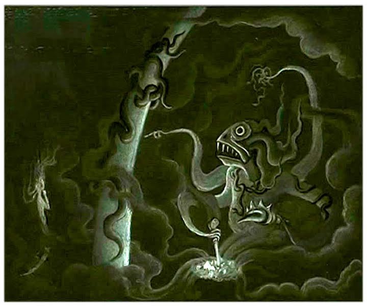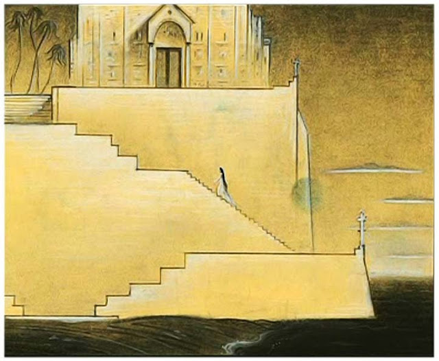
Rather than a specific piece of art itself, I found interest in an artist and their work in general. Kay Nielsen, born in the 1800s in Copenhagen, was an illustrator under Disney who inspired and worked on many well-known Disney pieces today (Fantasia, The Little Mermaid, Sleeping Beauty, etc.) Known for his intricate, darker art style, Nielsen offered Disney an art style that was not always appreciated or utilized in its time.

His work in The Little Mermaid, for example, was shelved before being picked up for the 1989 version, after Nielsen’s death. Obviously, the artwork pictured is much different than the bright, playful Little Mermaid we know of, even with the elements that parallel. The ethereal, other-worldly feeling of Nielsen’s art has retained its inspiring qualities despite the years that have passed since its conception.

This piece, for example, retains Andersen’s darker Little Mermaid tale. It is interesting to think about what possibly could have been from Nielsen’s work, had he not been let go numerous times throughout his run at Disney. What could we have possibly received if Nielsen’s concepts had been continued from when they were originally published? Would his work on The Little Mermaid have remained a silencing and at times brooding lesson in disguise, truer to Andersen’s vision, or would it have been polished and cleaned through processing at Disney?
These questions may not necessarily have answers, but it is very interesting to think of what Disney’s The Little Mermaid might have been like if it stuck truer to Andersen’s original work through the inspiration of Nielsen.

Something that has always bothered me about the Disney version of “The Little Mermaid” is that the colors are so bright. I love the original tale because it has a slightly creepy, gloomy tone. This artist is so cool! It would have been so interesting to see what “The Little Mermaid” in this art style would have been like!